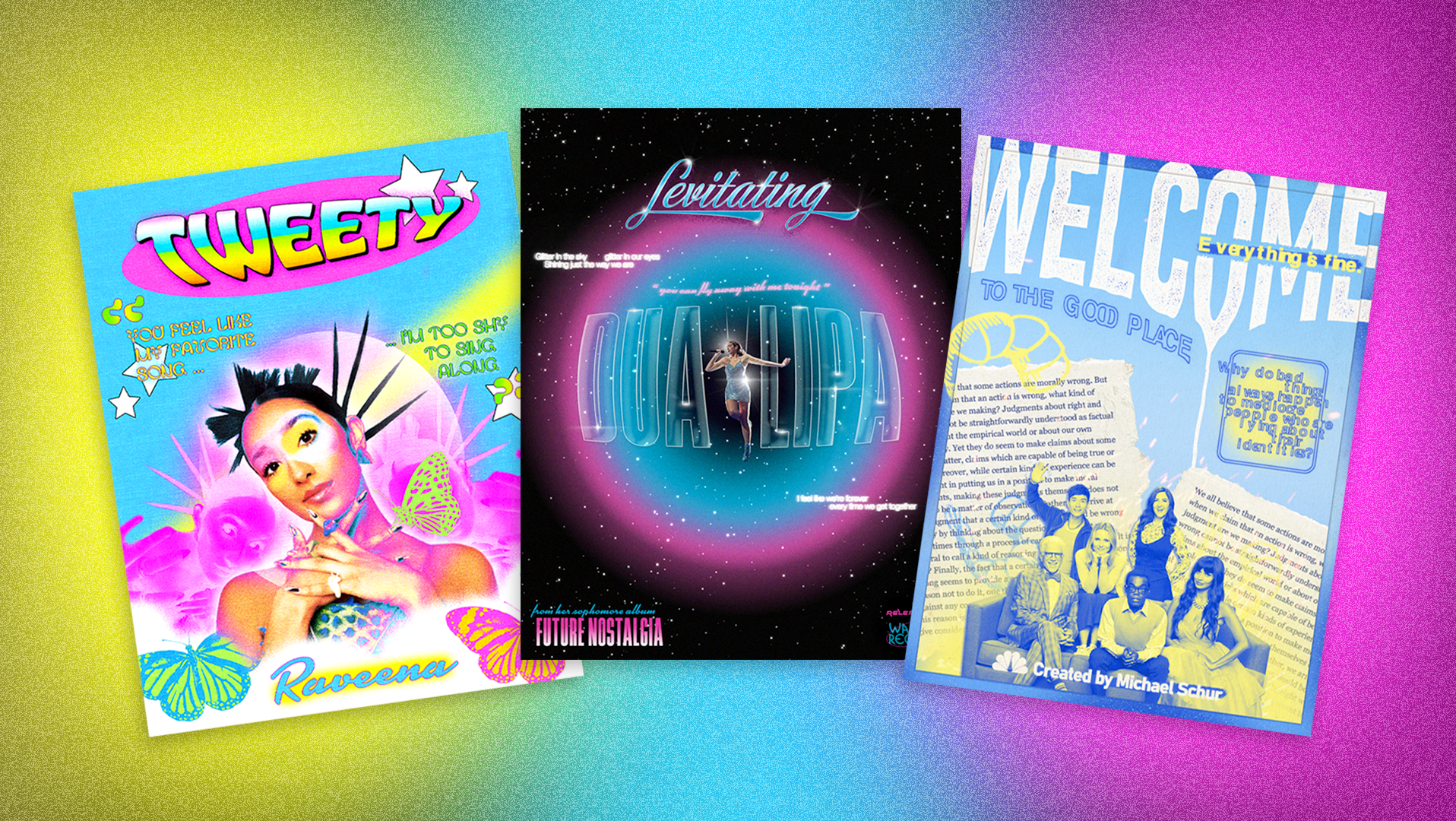
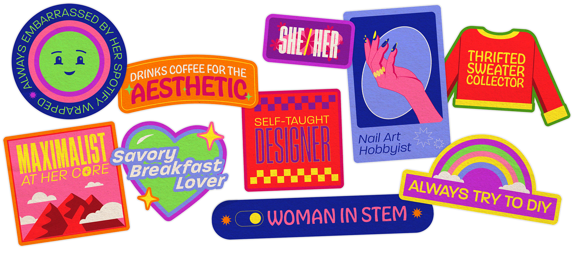
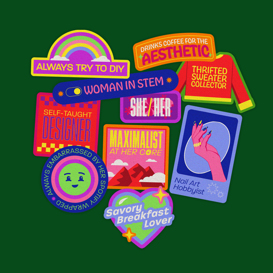
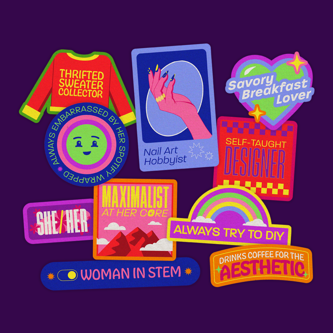
✳ 'About' Stickers ✳
Illustrated redesign of the stickers on my 'About' page
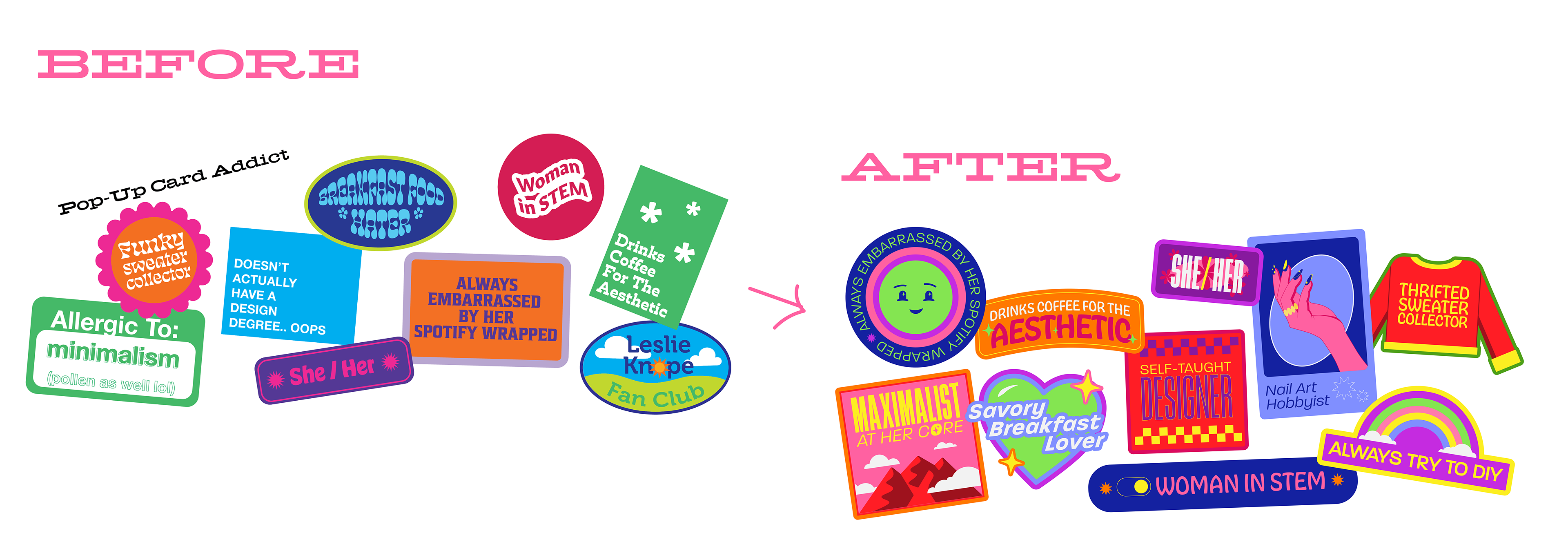
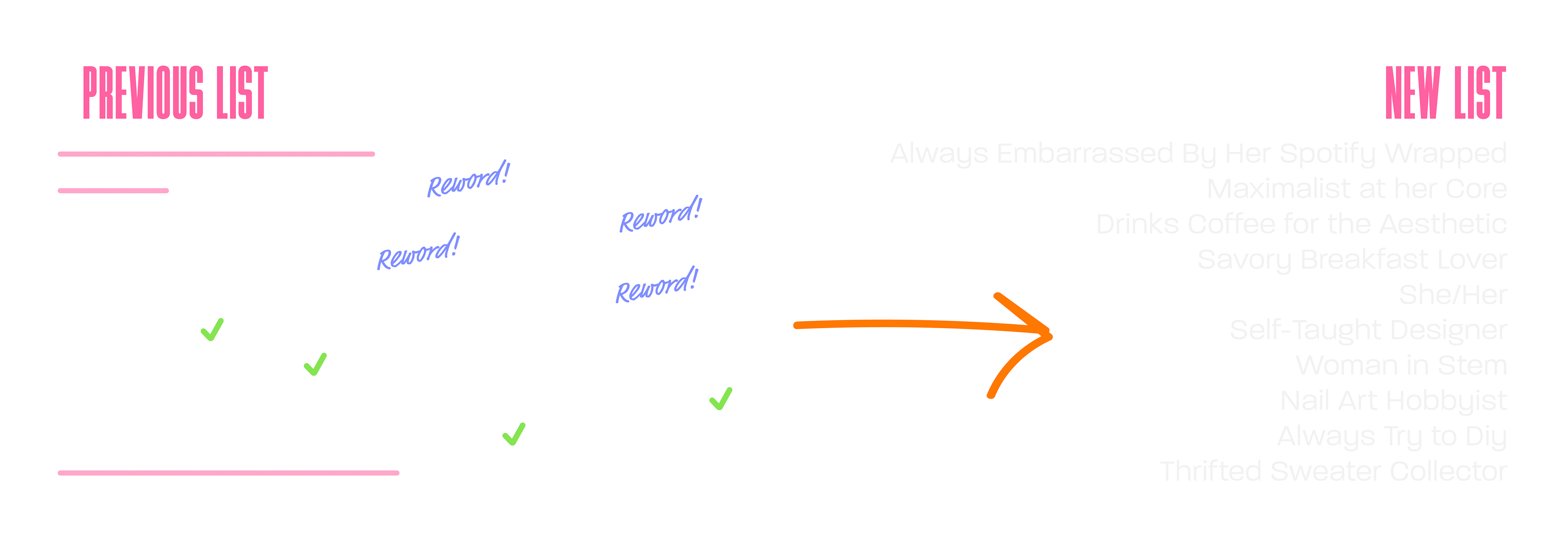
Phrases Revision
Starting with the previous list on my last set of stickers, I considered which phrases were most relevant, needed to be revised, or no longer applied to me. Many of them stayed the same like "Drinks coffee for the aesthetic", some were reworded to be clearer like "allergic to minimalism" changed into "maximalist at her core," and others were replaced entirely like "pop-up card addict" changed to "nail art hobbyist" since that is my current fixation.
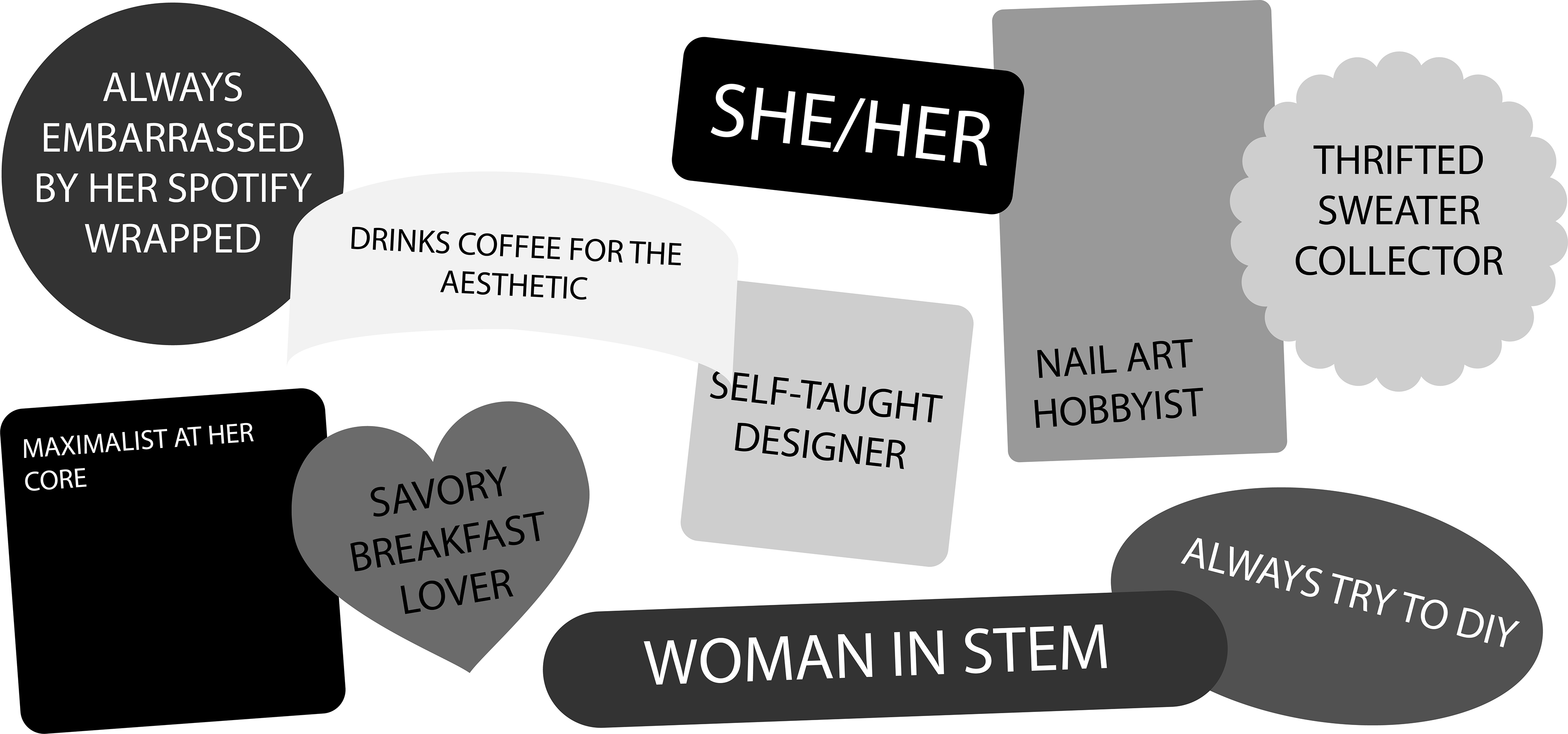
Sketching
With a finalized list, I began playing with shapes and experimenting ways to create a balanced composition. The best part about stickers to me is how you can make them any shape you want, so I explored having the shapes be wrapped around the text, standardizing the shapes as only squares or circles, etc. In the end, I found that diverse shapes with the text inside allowed me to easily rearrange the stickers and avoid them feeling monotonous.
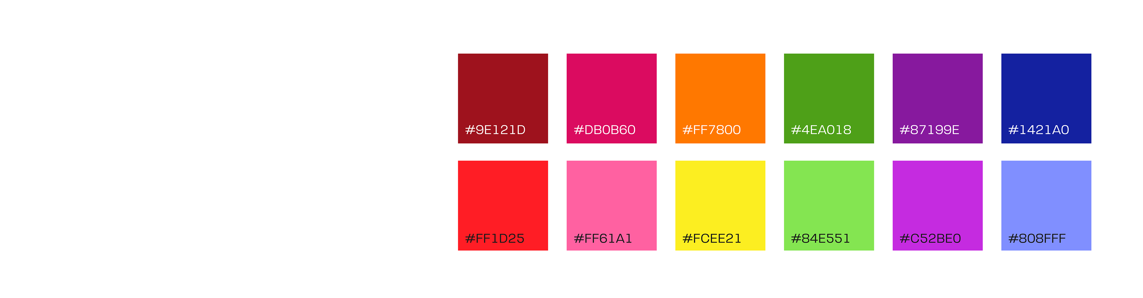
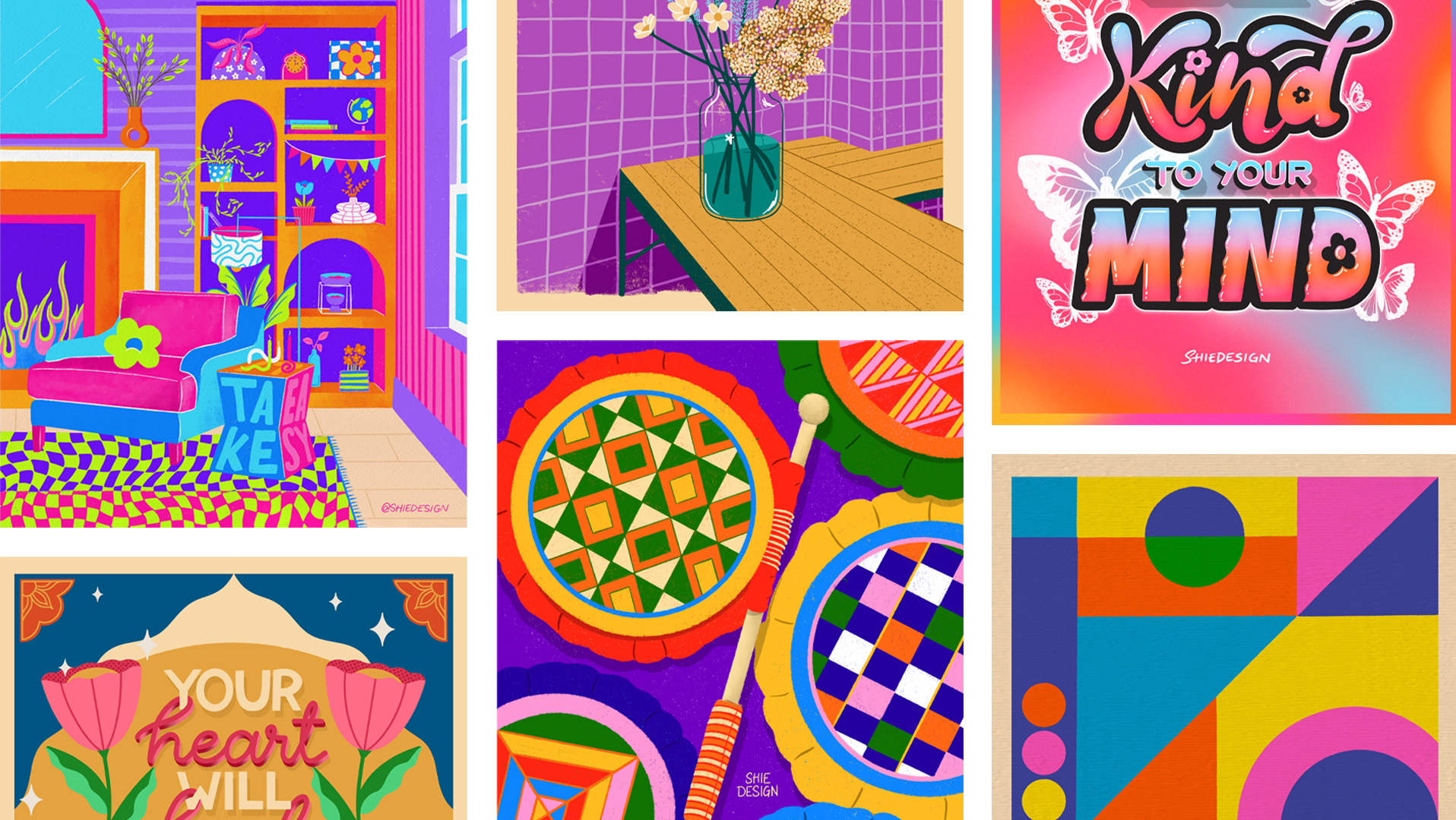
Style Guide
Lastly came finalizing the typefaces and color palette. In my previous iteration of stickers, I chose to use a new type with almost every sticker, but in reflection it felt disjointed and lacked purpose. For the revision I narrowed my choices down to three fonts: a standard sans serif, and two fun sans serifs that have lots of personality. This provided me variety in the types I chose for my stickers, but maintained a cohesive look overall. For the colors, I wanted more variety, and vibrancy and chose a bright rainbow palette.