✳ Poster Series ✳
Typographic and collage study conceptual posters that pays homage to some of my favorite musicians, shows, and books.
CTRL, 8.5x11in
Album by SZA
Album by SZA
Re-inspired from the release of SZA's sophomore album, SOS, I revisited the her debut, CTRL, with new-found admiration and inspiration.
Behind the Design
The visual aesthetic for the CTRL album involved greenery, softness, and late 90s / early 2000s technology. The call to old tech is integral to the album's meaning, so I incorporated this into the new design but changed the greenery to be inspired by blue skies.

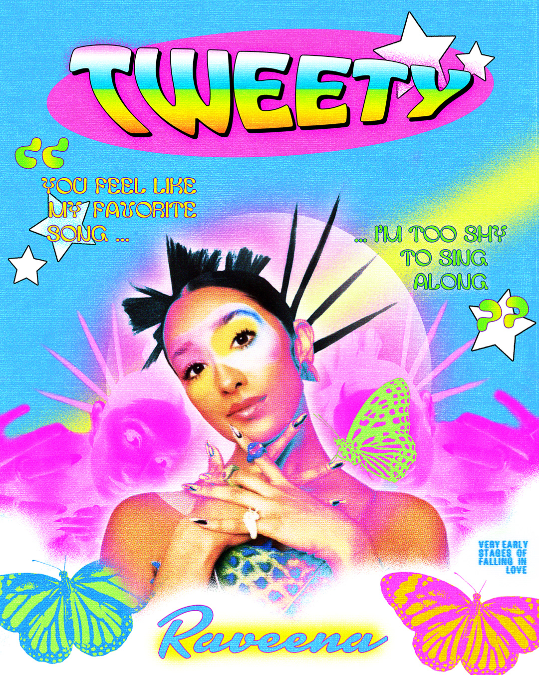
Tweety Bird, 8x10in
Song by Raveena Aurora
Song by Raveena Aurora
Utilizing the theme of "young love" from Raveena's song "Tweety", I created this poster inspired by the early 2000's and teenage magazines.
Behind the Design
Starting with an image of Raveena by @coughs on instagram, I used the eye makeup look as my poster's color palette. For the visual hierarchy of the design I placed the text and Raveena's head at opposite angles: allowing your eye to naturally zig zag down the poster. This is carried with the slanted quote and butterflies. In the lyrics Raveena mentions butterflies 3 times - leading me to add 3 in my poster design. Overall the poster leans heavily into J-14 and grungier design aesthetics while maintaining a healthy balance of both.
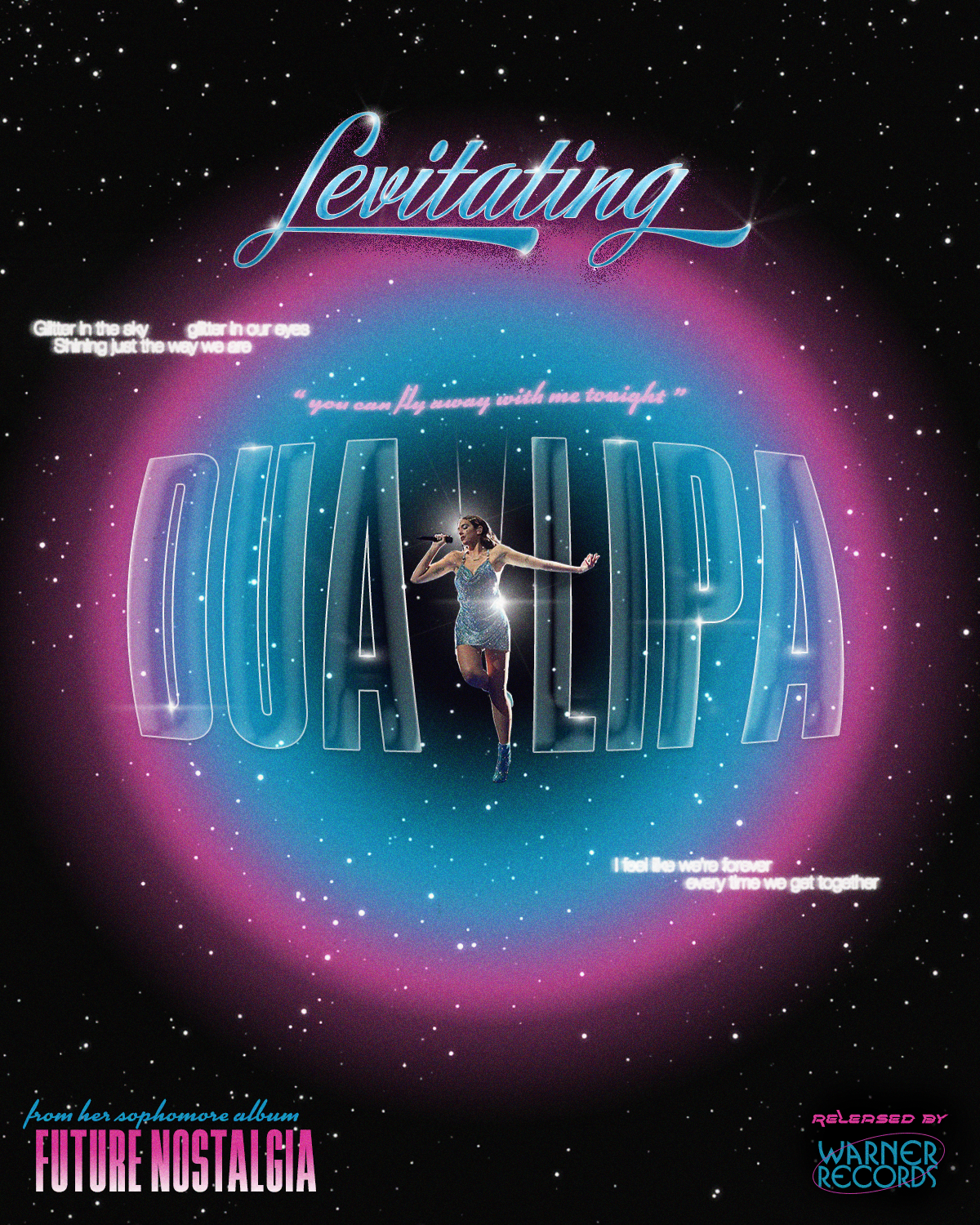
An Ode to Levitating, 8x10in
'Future Nostalgia' by Dua Lipa
'Future Nostalgia' by Dua Lipa
I've watched Dua's AMA's performance of Levitating maybe 500 times by now. I'm obsessed. I couldn't get the song out of my head - so I channeled my love for Dua into this conceptual song poster.
Behind the Design
For this design I embraced Dua's love for retro futurism, pink and blue together, and feminine aesthetics. Utilizing 'blending options' on photoshop: I was able to create textures in Dua's name, a faux chrome in Levitating, and all other text distortions. The sparkles all around help create tie together the galactic "starry" theme of the poster.
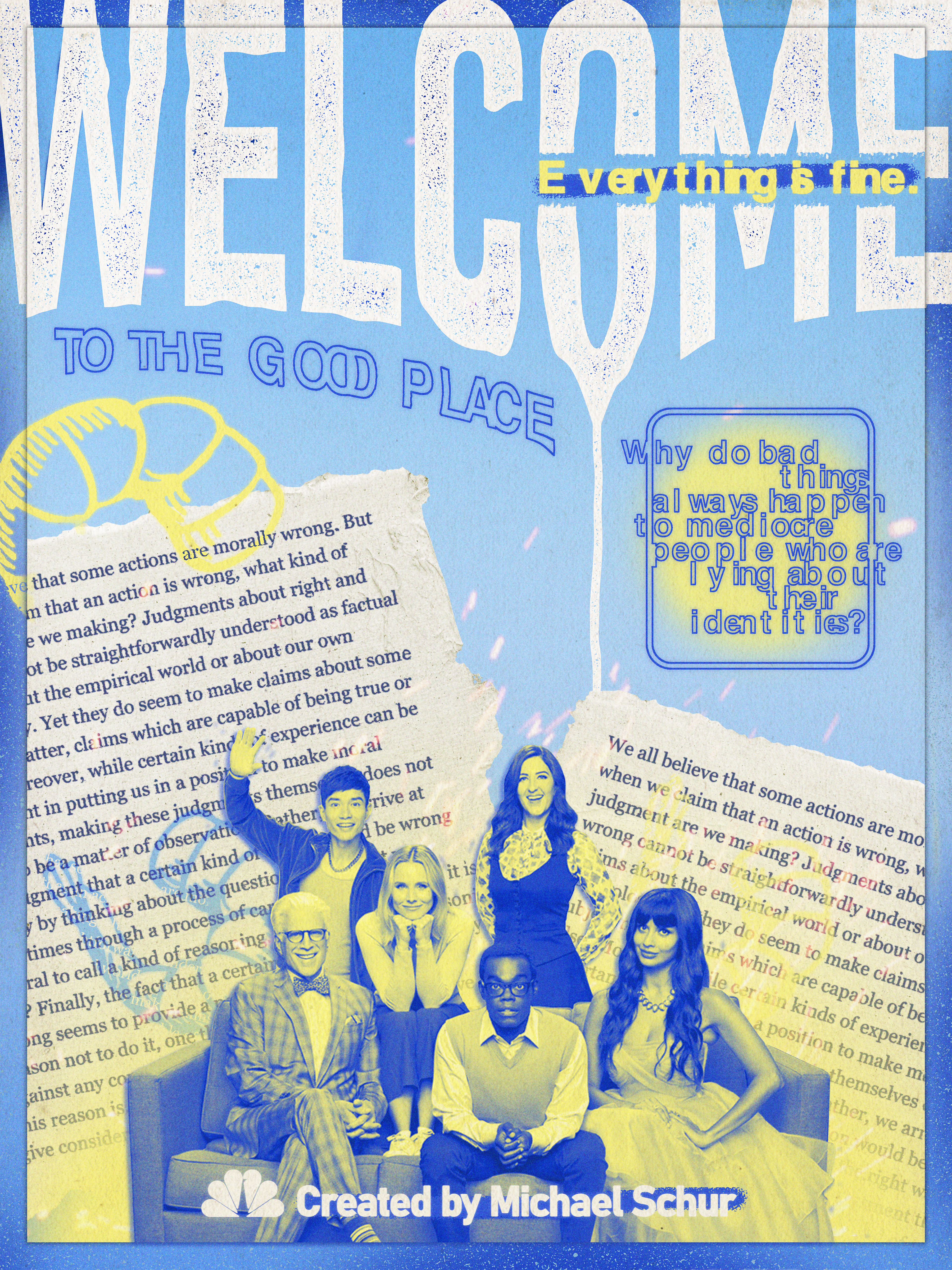
The Good Place, 9x12in
NBC Show by Michael Schur
NBC Show by Michael Schur
No tv show has left a larger impact on me than 'The Good Place'. I carry the moral and philosophical lessons into my life and challenge myself to be a better person every day.
Behind the Design
Finally, the perfect opportunity to use 'Hellvetica' (on a poster about hell). All elements of this design are references to the show: the flying shrimp, pages from Scanlon's book, "What We Owe to Each Other", yellow gradient at the bottom representing both the sun and fire, the word "Welcome" being dragged down to hell, and yellow/blue color palette.
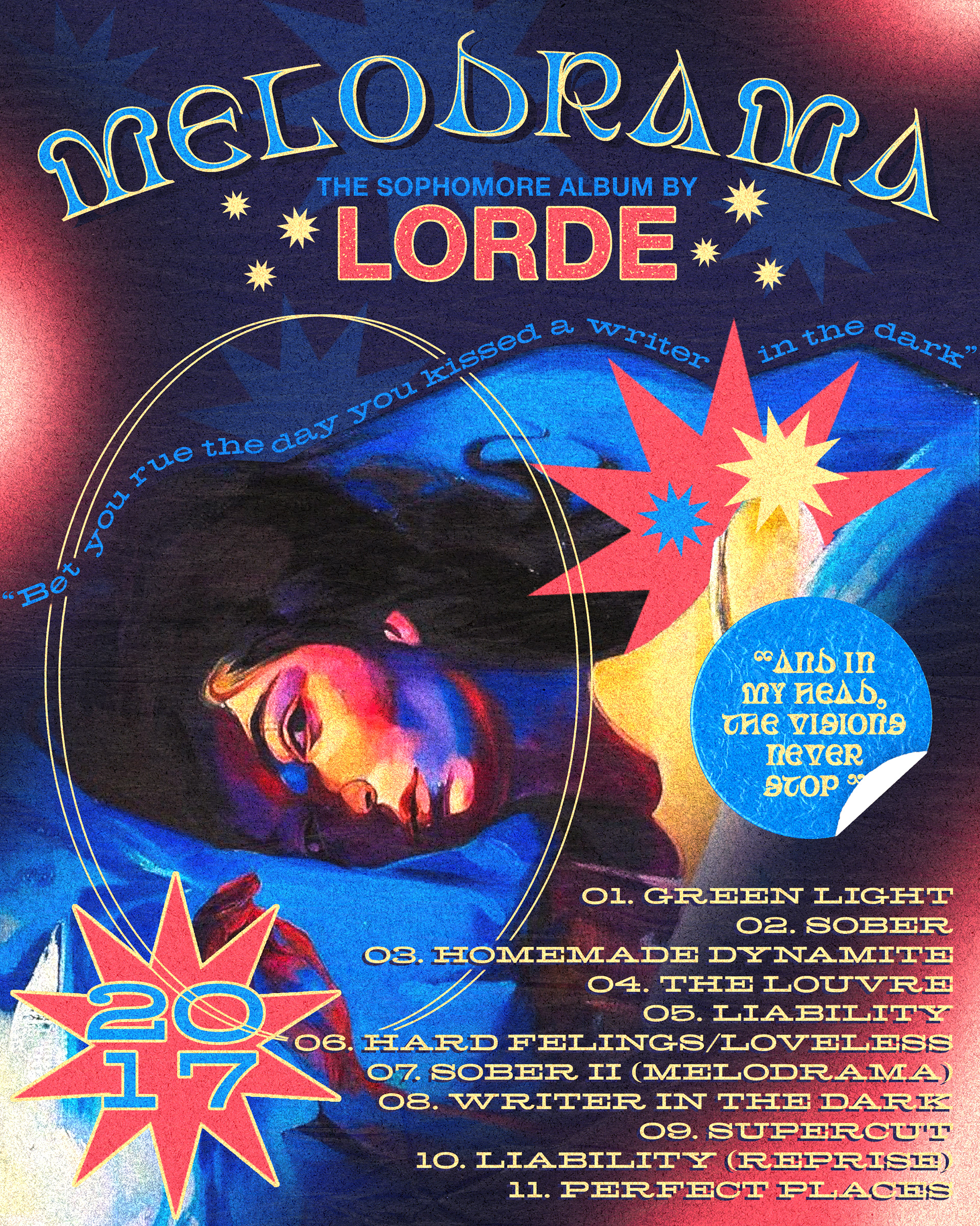
Melodrama, 8x10in
Album by Lorde
Album by Lorde
It's been 3 years since the release of Melodrama and I still listen to it every week. The album itself is dark, unconventional, and so full of life that I knew it would be the perfect inspiration for my first attempt at a music poster.
Behind the Design
The album art for Melodrama is one of my favorites of all time so I made it the main focus. The circles emphasize her portrait and draw your attention towards her eye. From here, I played with mixing more fonts than I'm used to and creating a balanced and maximalist design. My poster mimics her aesthetic and tries to capture the magic of Lorde in one page.
The album art for Melodrama is one of my favorites of all time so I made it the main focus. The circles emphasize her portrait and draw your attention towards her eye. From here, I played with mixing more fonts than I'm used to and creating a balanced and maximalist design. My poster mimics her aesthetic and tries to capture the magic of Lorde in one page.
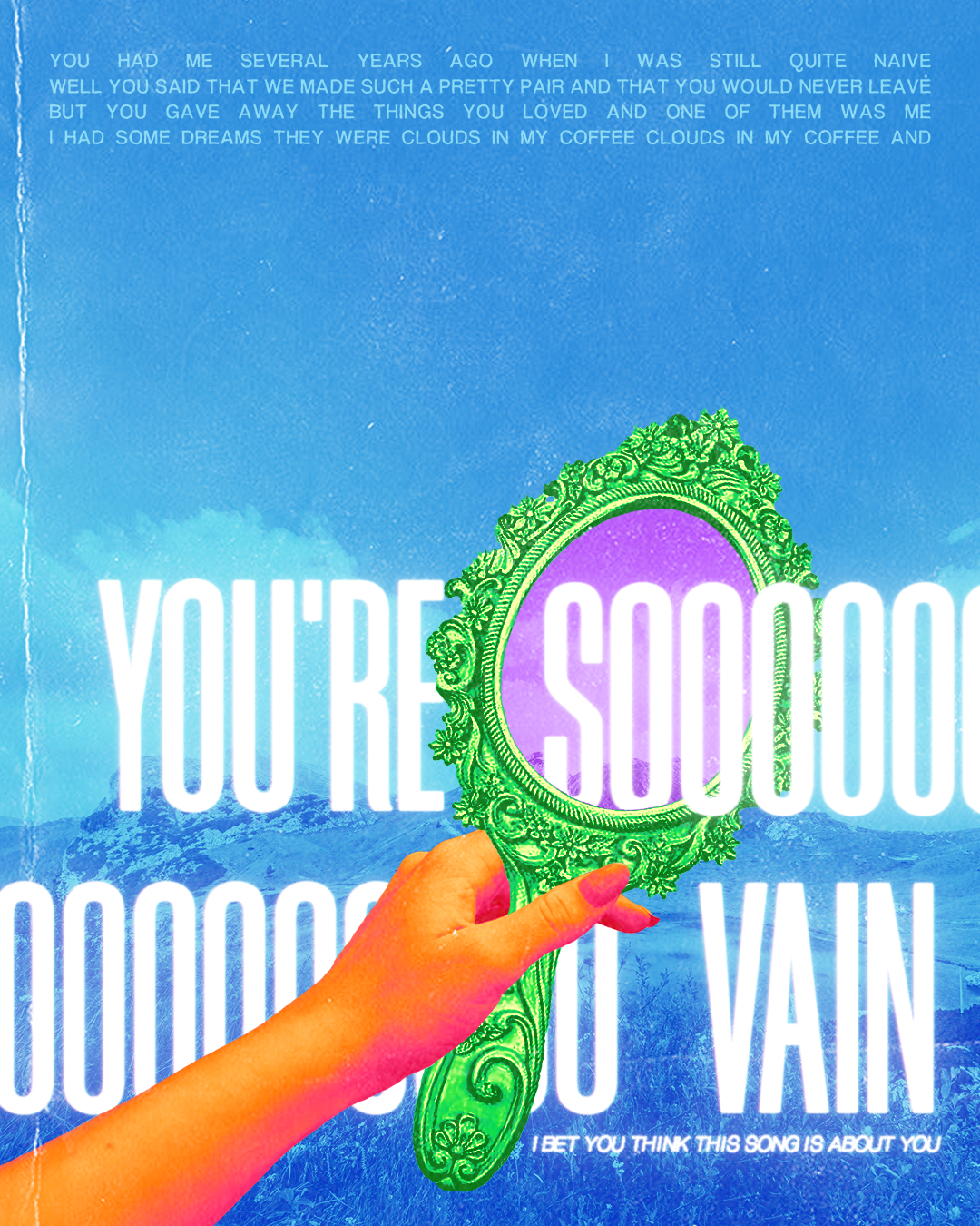
You're So Vain, 8x10in
Song from How to Lose a Guy in 10 Days
Song from How to Lose a Guy in 10 Days
How to Lose a Guy in 10 Days is one of my favorite romantic comedies of all time, and I particularly love the scene where the love interests sing 'You're So Vain'.
Behind the Design
Collage work!! The hand and mirror were separate photos that I added together. 'So' was stretched similar to the sound in the song representing the length of time you're singing it for. Also the colors are fun for no reason other than they're fun to be honest.
Behind the Design
Collage work!! The hand and mirror were separate photos that I added together. 'So' was stretched similar to the sound in the song representing the length of time you're singing it for. Also the colors are fun for no reason other than they're fun to be honest.
Additional Work